
/ CASE STUDY — STARBUCKS CAREER SITE
From customer
to partner
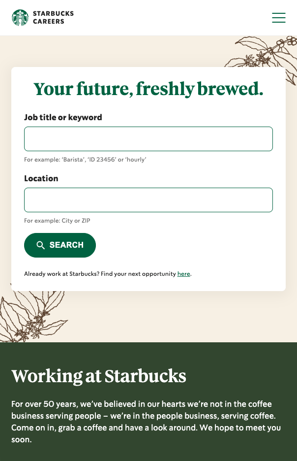
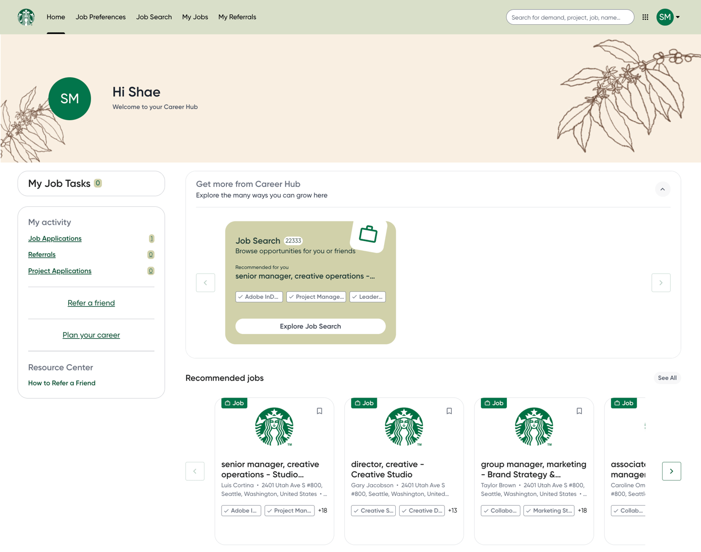
The visual identity, tone, and user flow of the career site were inconsistent across touchpoints, which created friction for candidates and partners. In order to attract top talent and reinforce our brand, we needed to redesign both the front-end and back-end experiences to ensure alignment in look, feel, and functionality—creating a seamless, engaging journey from discovery to application.
— PROBLEM TO SOLVE
Our current career brand site and backend recruiting platform do not reflect Starbucks updated brand standards nor does it deliver a cohesive user experience.
MY ROLE
- Art director
- Designer
— THE PROCESS
Creating a seamless, engaging experience
We started by listening to candidates and recruiters to understand their needs and frustrations with the existing site. Insights led us to prioritize a more inclusive and emotionally engaging experience, which we brought to life through refreshed brand colors, expressive illustrations, and partner storytelling. Prototypes were tested with real users to refine navigation, accessibility, and visual impact.
MEASURING SUCCESS
Unifying the candidate and recruiter experience through cohesive design
Designing a simplified candidate journey
Bringing consistency to the recruiter experience
Improved candidate navigation and reduced friction across the application journey based on usability testing insights.
Increased consistency and efficiency for recruiters through a standardized backend experience.